Switzerland
AB Commodities • Group & Subsidiary Rebranding
Visual Identity
Logo Design
Pitch Deck
Complete visual identity, presentation systems, and pitch decks crafted to communicate complex ideas. Continued creative support as a trusted design partner.
Switzerland
AB Commodities • Group & Subsidiary Rebranding
Visual Identity
Logo Design
Pitch Deck
Logo and visual identity redesign for the parent company and its subsidiaries, preserving brand recognition without radical changes.
Switzerland
AB Commodities • Group & Subsidiary Rebranding
Visual Identity
Logo Design
Pitch Deck
Logo and visual identity redesign for the parent company and its subsidiaries, preserving brand recognition without radical changes.


1
1
Visual Identity
Visual Identity
AB Commodities is an international commodities trading firm, focusing on energy physical commodities, their derivatives, shipping and storage.
The aim of the Company is to add value and de-risk the energy supply chain by offering best in class service to its partners, counterparties and clients, maximize returns for all stakeholders, and work towards a sustainable future.
A clean, geometric identity that reflects the company’s character with a modern, minimalist approach.
AB Commodities is an international commodities trading firm, focusing on energy physical commodities, their derivatives, shipping and storage.
The aim of the Company is to add value and de-risk the energy supply chain by offering best in class service to its partners, counterparties and clients, maximize returns for all stakeholders, and work towards a sustainable future.
A clean, geometric identity that reflects the company’s character with a modern, minimalist approach.
AB Commodities is an international commodities trading firm, focusing on energy physical commodities, their derivatives, shipping and storage.
The aim of the Company is to add value and de-risk the energy supply chain by offering best in class service to its partners, counterparties and clients, maximize returns for all stakeholders, and work towards a sustainable future.
A clean, geometric identity that reflects the company’s character with a modern, minimalist approach.


The AB Group logo redesign covered the parent company, AB Commodities, and its subsidiaries. We kept the signature AB lettering, brand colors, and patterns to preserve brand recognition while modernizing the visual identity.
Bolder typography distinguishes the parent company, while lighter weights identify its subsidiaries.
The AB Group logo redesign covered the parent company, AB Commodities, and its subsidiaries. We kept the signature AB lettering, brand colors, and patterns to preserve brand recognition while modernizing the visual identity.
Bolder typography distinguishes the parent company, while lighter weights identify its subsidiaries.


2
2
Branded Materials
Branded Materials
The visual identity is consistently applied across brand collateral, including presentations, client and partner pitch decks, and contracts, while maintaining an elegant look without distracting from the content.
The visual identity is consistently applied across brand collateral, including presentations, client and partner pitch decks, and contracts, while maintaining an elegant look without distracting from the content.
A clean, minimalist visual style built on geometric shapes and lines keeps the design modern and the content easy to scan without visual fatigue.
The slanted square serves as a core graphic element across all brand materials in various rotations. The straight line from the logo also takes on a functional role, adding structure to layouts.
The selected color palette and geometric pattern are applied across letterheads and presentations, creating a cohesive, professional look.
The selected color palette and geometric pattern are applied across letterheads and presentations, creating a cohesive, professional look.
A clean, minimalist visual style built on geometric shapes and lines keeps the design modern and the content easy to scan without visual fatigue.
The slanted square serves as a core graphic element across all brand materials in various rotations. The straight line from the logo also takes on a functional role, adding structure to layouts.

oTHER PROJECTS

Switzerland
Tradeon • Enterprise Website to Communicate Complex Operations
Tradeon • Enterprise Website to Communicate Complex Operations
Web design
Web design
Commodity Trading
Commodity Trading
UK
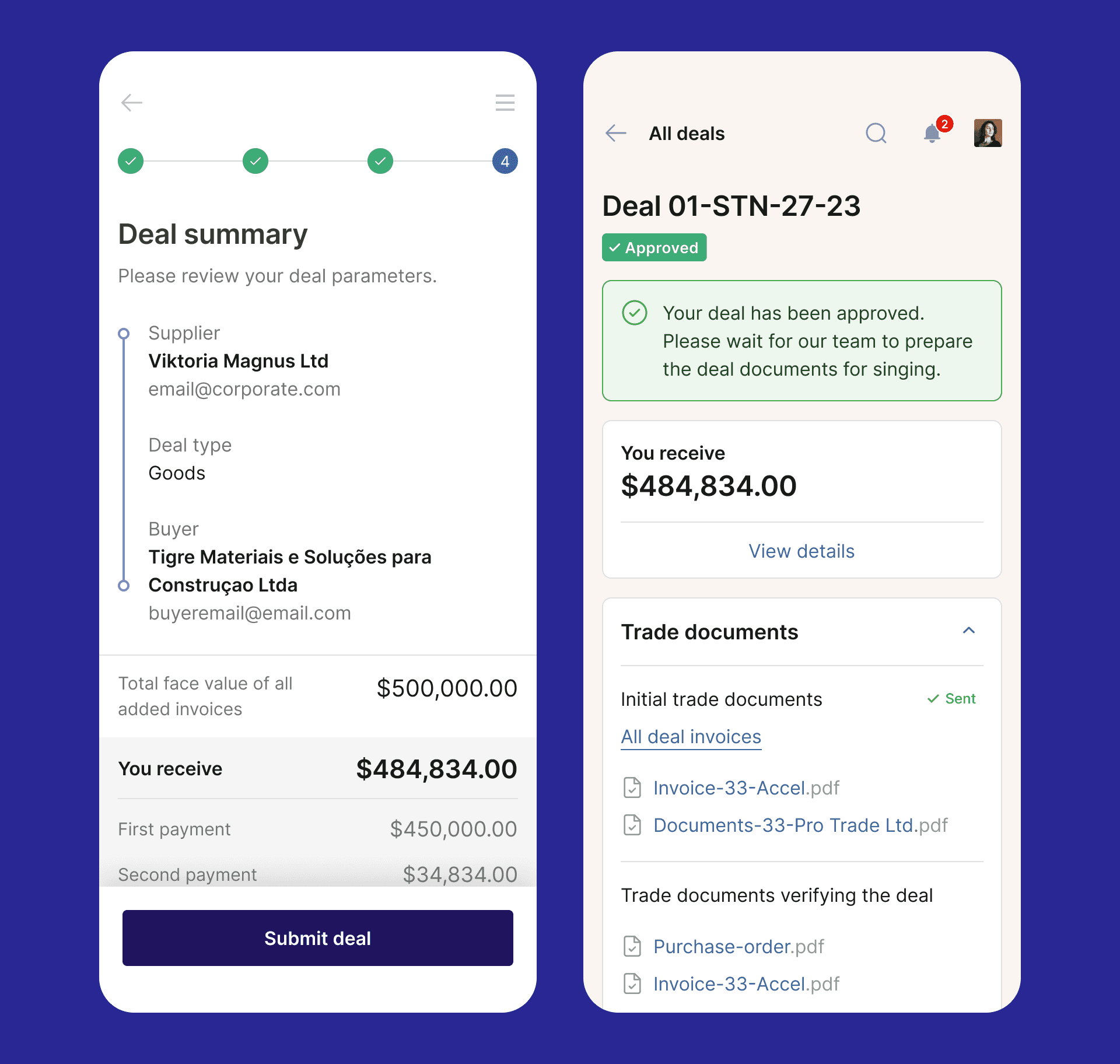
Global Factoring SaaS With Automated Deal Pre-Scan
Global Factoring SaaS With Automated Deal Pre-Scan
UX/UI Product Design
UX/UI Product Design
B2B SaaS
B2B SaaS
FinTech
FinTech
Viktoria Magnus Studio is a founder-led design studio focused on complex solutions, providing ongoing design support and taking on standalone projects.
© Viktoria Magnus Studio 2026. All rights reserved
Viktoria Magnus Studio is a founder-led design studio focused on complex solutions, providing ongoing design support and taking on standalone projects.
© Viktoria Magnus Studio 2026. All rights reserved
Viktoria Magnus Studio is a founder-led design studio focused on complex solutions, providing ongoing design support and taking on standalone projects.
© Viktoria Magnus Studio 2026. All rights reserved